Another year gone by, and truth be told, I see no real reason for this blog to exist. Maybe I'll delete it. For now though, let's just make another post. I had the idea to do a step by step description of a recent painting, since I think it's probably my best work so far. I also want to give a general summary of what could by called my "creative process" at the moment, since the process itself is something I feel like has come a long way, while all the same still feeling very inefficient.
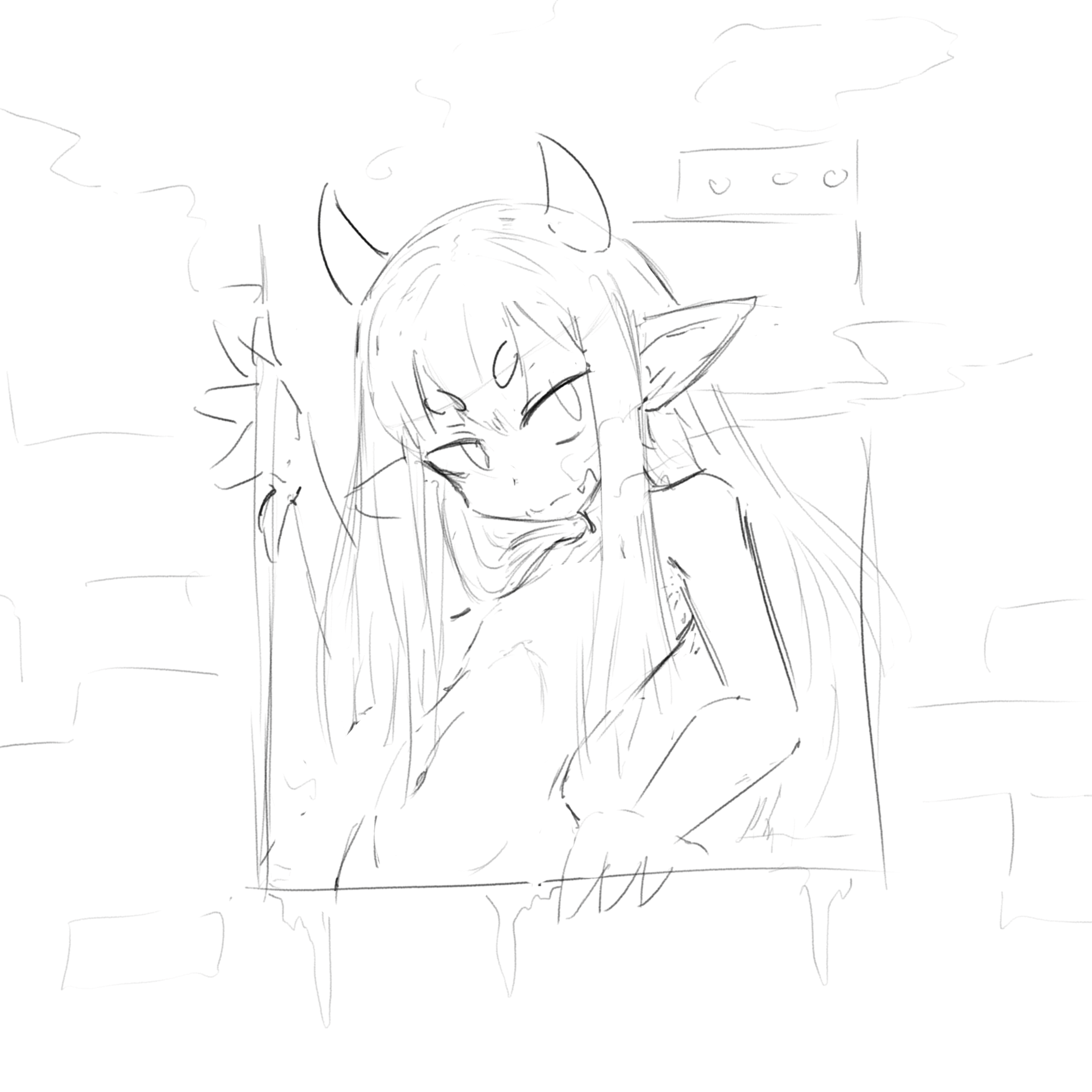

So here was the initial sketch. This was done in July, during a time when I was mass producing lazy little drawings like this. It's pretty normal as far as that kind of thing goes, though in this case I knew immediately that I intended to properly finish it, just because of the character. The coloring was also done at the same time, just planning out the general idea of how it should look. Of course, as usual, I was preoccupied by something else, so this was placed on the backburner for a long time.

In mid December, after completing a monstrous project, I finally returned to this one. So this is basically just continuing on the existing sketch, drawing right over it and fleshing things out. My plan at the time was to keep this one "lazy", since I had lots of similar sketches I wanted to clear out before starting anything new.
Truth be told, I can barely remember doing most of this, even though it was just earlier this month. I only remember spending a long time on the hands and the left arm. At some point I realized that the arm needed to be raised in that manner, with the elbow pointing into the background, in order for the hand to make any sense. Of course, the arm itself doesn't really add up, but I figured I could get away with it just by hiding the elbow behind the hair. Regardless, I think it's a good change. More "active". I have a bad habit of flattening poses toward the viewer, like an Egyptian painting or something. It's still pretty flat of course, but not as much. I also wanted to add in various machinery around the border, but decided to delay it until later, and of course eventually decided to just leave it out.


I actually deviated tremendously from the sketch this time, mostly because my investment in the drawing had steadily increased and I no longer felt like the hair was acceptable, so I kind of revised it as I went. This was a clumsy and disorganized thing to do, but I guess it worked out. I also twisted the arm upward a little more, and realized that I actually just forgot to take the ears beyond a simple placeholder. The ears in the third image here are still in a sketch-like state on a separate layer. I postponed properly finishing them until later. The face is also still unfinished.
I decided with this drawing that I would keep the lines relatively thin. In the past I've typically tried to use a lot of varied line thickness; however, I've begun to get the impression (partly from studying Japanese artists and partly from looking over my own shit) that if the image is going to be colored, extremely thick lines may be a mistake.


Next I started planning the colors. In the previously mentioned monstrous project, I experimented a lot with combining green and flesh tones, and found that it can present some issues. Green and red are opposite colors, so they don't really mix properly. Here I was comparing a relatively normal color palette (on the left) with a more green suffused variant. The little circles to the left of each are the color of the hair and skin at maximum brightness or whatever. In the context of a green background, the greener tones seem much more correct to me, so that's what I went with.


And here began an arduous process. I don't really understand painting at all. What I'm doing here is essentially just experimenting. I don't have a clear idea of what this should look like, so I just throw colors around and see what happens, with the goal of arriving at some kind of plan. If I can quickly and messily create a semblance of something decent, then I can redo it more carefully with knowledge of what I'm trying to do. I think this entire phase would be unnecessary if I was more experienced, but for now every painting is a learning experience.
So going through these, I immediately darkened the green in the background. It just looked better to me. For the highlights in the hair I decided on this blueish green color. With the skin I just did whatever. Then all of a sudden I decided he should be lit from below, so I changed the lighting on the skin and added a brighter green to the lower half of the background. In the third image I've finally finished the ears and face. In the fourth I had the idea to significantly darken the forward arm, along with the chest and right ear to a lesser extent. Since this is a slightly weird painting where the light is ostensibly coming from behind and below, I hoped darkening the more forward parts of his body would improve the sense of depth.


I messed with the skin some more. I think darkening the right side was correct, but it was too uniform and created the impression the character just has dark skin, rather than that area being in shadow. From there I settled on these options for the lighting on top of his head. Maybe it seems silly, but I was actually quite torn over this. I felt that in isolation, the more varied coloring in the first one was more interesting, but taking the image as a whole the simple blob of highlight looked better. If I had to guess, I think it's because the bottom of the image is already fairly busy, so making the coloring in the upper area comparatively simple creates some kind of favorable dynamic. It also contrasts with the horns and face slightly more strongly. Now, I'm not sure either of these options really makes sense from a lighting standpoint, but that's too much to worry about now.


And from there began the even more arduous process of actually finalizing the colors. In the experimental phase, all the painting was done on a single layer. It actually felt great to paint like that, so I decided not to divide up the coloring too much at this time. In previous paintings, I've made several layers just for the hair, several for the skin, etc. This time each "main region" just got a single layer, and I just blended the lighter and darker tones freely with each other.
Overall this was the most time consuming part, and I never really reached a point where I felt like it was truly done. I just had to decide to stop messing with it after a while. Also somewhere along the lines I moved the bellybutton.

And finally, the last thing was the smoke. By now I was exhausted, so I didn't go too crazy with it. I also messed with the background a little more, adding some vertical streaks and an even brighter glow at the very bottom. Technically, of course, it isn't truly finished. His erect dick is supposed to be visible, but I'll probably get around to that later. I also initially envisioned him exhaling a trail of smoke as well, but I think that's more than I can manage with this one. Likewise the external area could have something going on. Perhaps machinery, perhaps just a starry night sky, but I don't think I'll bother with that either.
Anyway, this character is really precious to me. I mentioned him before, saying that I wanted to do him justice or something like that. I don't think I have yet, but for now, I'm pleased with this work. Maybe in the future I'll determine that it's actually just terrible. That's often what happens.